The main central image is right in the middle and presented uniquely in this brochure. It's different and stylised an a way that it invokes the reader's attention to the detail and urges them to see the image with a different perspective. This is very unusual as the image is not clear at all and is edited with different colours but put into the text, this distorted effect breaks key conventions of making the central image clear and presentable and relates to the kind of reader that it is aimed it. The image is edited in a way to follow the colour scheme of the BFI logo which makes the brochure much more consistent to the branding. The main title is clearly presented in the centre of the image and takes up the majority of the space to really stand out to the audience. This is very efficient in anchoring the target audience and making them read the brochure and get straight to the point of what it is that they are advertising.
3.Brochure Front Covers
Another cover that was introduced in the same year as the "BFI Flare" cover which could suggest that the use of a black background and bright text in front makes the visual point the brochure. I could also implement a similar technique with the black background and the contrast to make the text the visually appealing factor of the cover.
The slogan is at the top of the front cover which makes it visually interesting and the layout looks simple yet unique. The layout of this front cover is what I hope my print work resembles in some aspects.

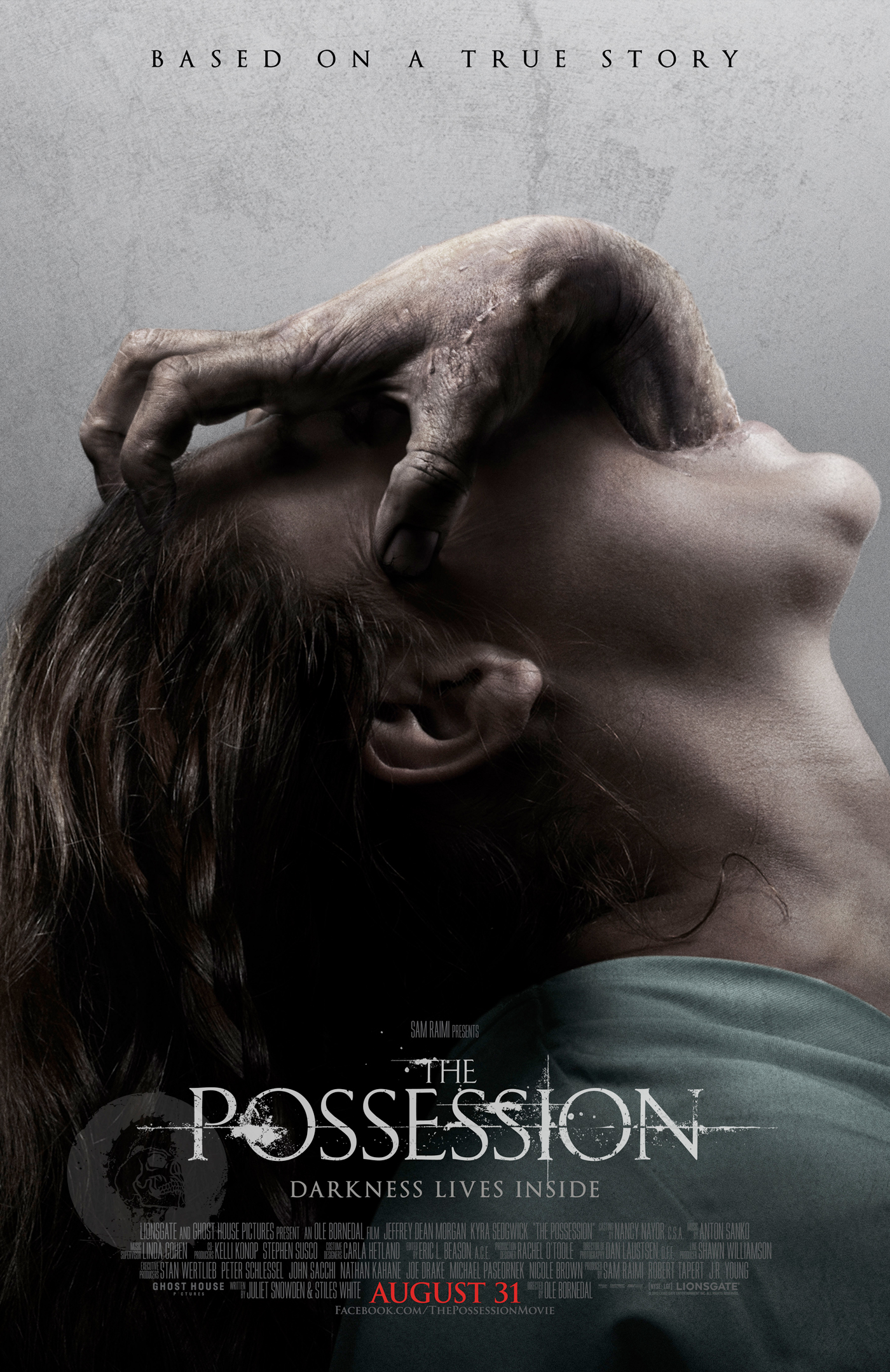
The over exaggerated expressions help to engage the audience and I think this is something that I would like to use in my cover with my photo shoot.
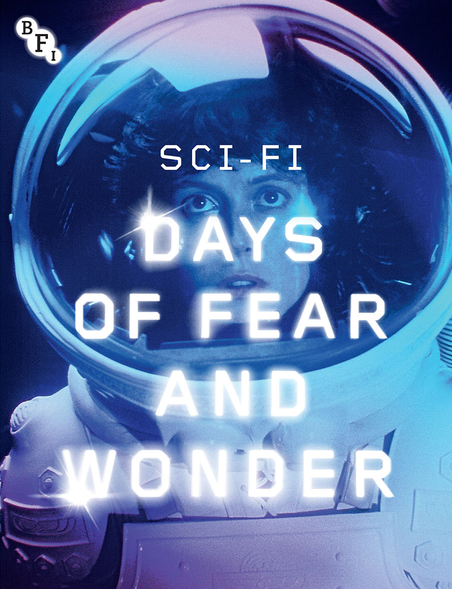
The text for me is one of the most appealing parts of the programme, due to it's glowing special effect and the brightness of it. It really stands out, but also links to the genre of Sci-fi. The central image is also one of the key features and most appealing parts of the programme as well, with it's filter and colour scheme, giving it a daydream essence.
This indicates, I will need to have something linking to the genre of my film on the programme cover.
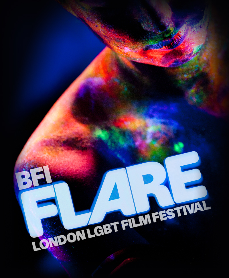
Firstly, there is the neon colour scheme, which contrasts to the simplistic colour scheme, of very few colours, on the usual BFI programmes. It goes to show that either a variety of colours and lack of colours is workable, giving the programme I'm making a broad range to work from. I love the graphics used, because the neon colours have been illuminated using black lights/ultra violet lights, which is extremely appealing, working with the text and colour scheme to make an extremely appealing piece.
4.Contents Page
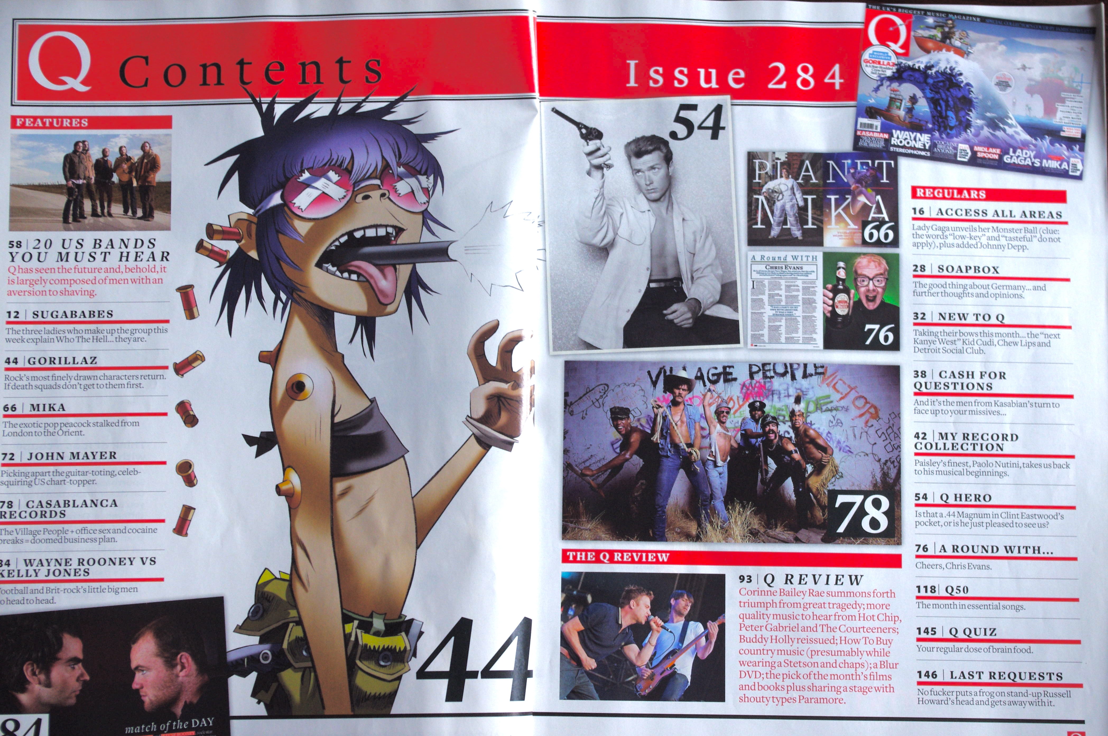
The colour scheme of the contents page is simple yet effective, with the black of the title, working well with the red. There isn't really a central image, but the most prominent and most notable one is the Gorilla's cartoon which takes up more space than the other images. However, all the other images included work well to give a short overview of what the magazine will be like well.
This is very unique again as the main character takes up the entirety of the page, holding a prop aimed directly at the camera which I would consider using as I think it is very effective in grabbing the audience and making them feel as if they are in the scene themselves. However, the contents page is coloured in contrast to the black and white and also stands out.

Everything is consolidated into what the viewer "must" know and not tossing an excessive amount of data at them. I can utilise brief depictions (counting pictures) of every film on the substance page with a brief portrayal of what every film is about. I like the utilisation of a foundation picture on the substance page and the use of little partition of content on the substance page. I may not want to have a plain foundation on mine as it will make the substance look uninteresting.

The title of the contents page is the most intriguing feature, as the red text is placed directly behind the central image, which works extremely well due to the brightness of the text and the white lining inside it. If it had been any other colour, it wouldn't have worked as well. The colour scheme is simple but effective with the red, white and black text and background working well together.

Images can be used as the actual 'copy' of the context page, there can be a page number on the image as the audience would be expected to already know what the image is based on i.e, the band. The text gives a brief description on some articles and things that may be new and not yet known by the audience.

This substance page is loaded with numerous photos and acts like a montage or some likeness thereof which makes it all the additionally intriguing and lovely. This innovative substance page can be utilised as an approach to snatch the viewers consideration because of the numerous pictures on the page and of how lovely its appearance is. What's more, the use of having the content inclined close by the collages pictures makes it more viable as it strengths the audience to tilt the book and take part in what is being displayed.
Planning and sketching
Target Audience:
Middle class students/audience
Age range- 17+
Females based demographic
Educated- students, readers
What will be on the front:
Gaming
Social Media
Psychology
Technology
Celebrities
To create a feature that will appeal to my target audience I will try and incorporate some of these things in the print, i.e include features on the subject of theme and mention them in the contents. Include social media links.
Photoshoot
For the photo shoot, I will use one character from the movie, myself, which will subvert typical ideologies of putting the main character at the front. I will be using theses shots: Close up/medium close up of the aforementioned shots, could shoot a medium close up and crop where appropriate. and an Extreme close up of eye and with that use Photoshop to show dilated eyes to represent the drugs used in our video . The costume will be a simple casual urban outfit.We will not feature any props. But, for make-up, they will do the same makeup they did for the filming which is simple and natural.
I would like to have solemn and 'moody' looks for the expressions, with one side more darker to represent the dark genre mood of the film.
I would like to have solemn and 'moody' looks for the expressions, with one side more darker to represent the dark genre mood of the film.