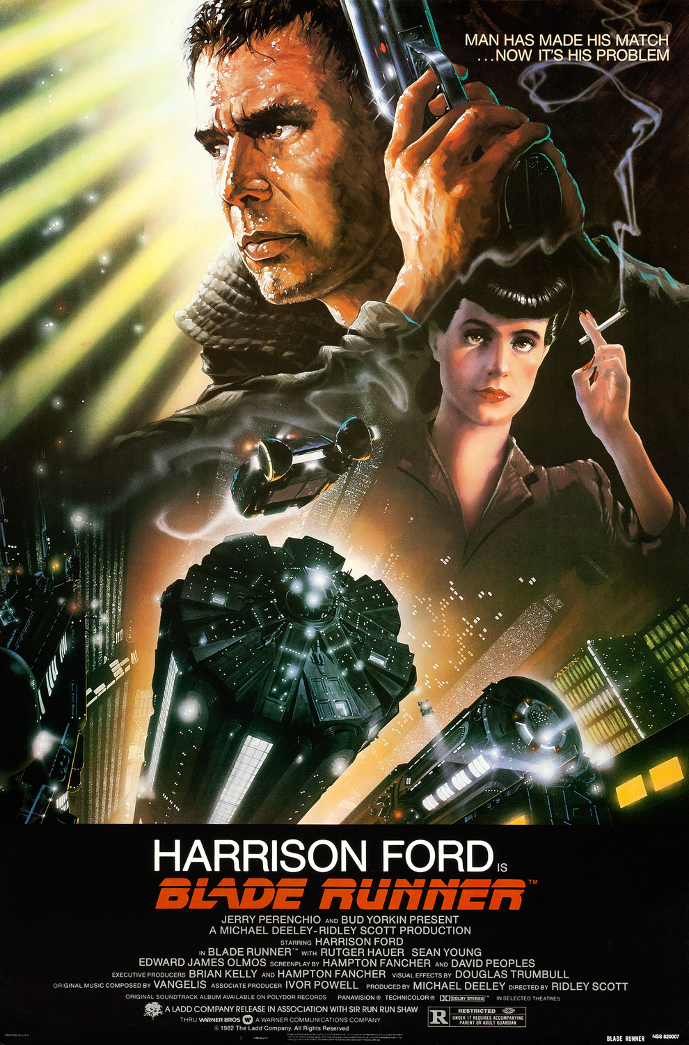
1. BLADE RUNNER
"Blade Runner"(1982), from what I can see, the key themes or conventions all point to a typical sci-fi genre. The city scpae is made to seem modern and futuristic by tall buildings having resemblance to UFOs and props used such a futuristic gun. The colour scheme of the poster strongly convey a theme of danger and darkness with the use of the coloured images.
You can notice the actors name to be much larger and take up the centre bottom of the poster, emphasising how the actor already has established a large fan base and so the movie will gain its popularity with the actor's name being in the movie. To continue, because on the poster the male character is much larger than the female may suggest the movie's target audience to be directed at males from 16-28 of age. The male is made to be bigger and shades than the female character leaving her in a much darker light; she holds a cigarette (which may not be advertised to children because of this) and has on red lipstick which could lead to the idea of a 'femme fetal'. The idea of the woman being of a love interest or obstacle is highlighted with the lighting and her being beneath him but still have a role as she is on the poster itself. The male has a bright light shining from behind him suggesting he is the protagonist but also the one who should bring about a peace or conclusion to what fight the poster is eluding to.

2. SCARY MOVIE 2
"Scary Movie 2"(2001) is a hybrid movie as it both includes horror and comedy. There is the use of a conventional colour scheme known to distinctive horror movies proposing the idea of danger and risk to the movie. But, the exaggerated facial expressions suggest the comedy side for the film that will be in it. The poster may advertise to young adults due to the premise that this movie may be a form of satire or parody, the reason as more commonly know Horror movies; "The Exorcist"(1973), "MAMA"(20130, aren't focused on the comedic value of their movie. Also the sexualised women and humorous content in the front row of the poster may draw the attention of a demographic of late teens and early 20s. Having seven characters who all have a large fan may lead to success and popularity for the movie, drawing attention to the poster from the public.
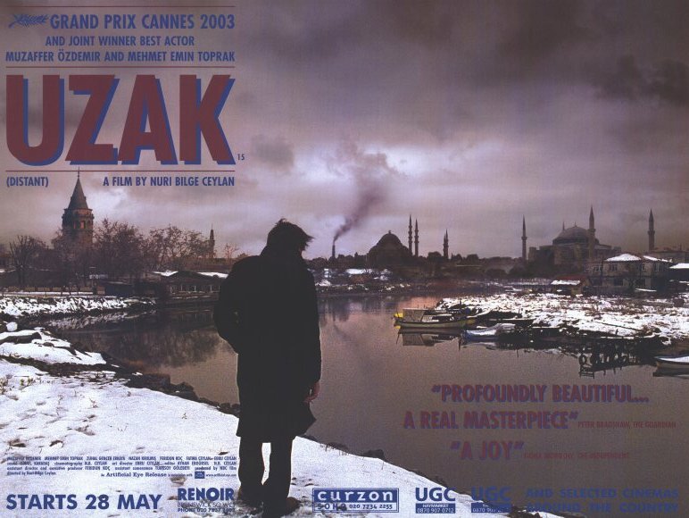
3. UZACK
Uzack is a drama film and is focused on the main character perspective during a time of war and turmoil. The poster suggests that this is of a 'world cinema' as the poster has foreign language scripted at the top. The dark sombre and smog colour scheme and the dark silhouette of the character centre around the theme of the movie such as despair and anguish. To add, the pathetic fallacy of the snow and dark clouds casting a shadow over the industrialised town, with the soot and ash coming out of a factory further connote to the themes of despair. This movie is also part of arthouse film which may elude to the longer reviews as arthouse movies don't need a large demographic of an actor or actress to be popular as it is more repute than commercial.
4. I'M NOT SCARED
This movie is another representation of 'world cinema' as it is of Italian origin. The movie is a quite a hybrid movie as it contains crime fiction, thriller, mystery, drama and many more. The sans serif typeface is merged with a fiery input ,and so, the movie may hold aspects of thriller or horror. The protagnist of the movie is looking down into the a hole and this striking angle gives a different viewpoint to the audience viewing it. The audience may not be suitable for children even with a child in the poster itself and may weigh to an older demographic of people.

5. SIN CITY
This poster suggests the movie is of thriller, action and detective genre as the lighting setting reinforces this idea. The colour scheme of dark poster and black and white colour scheme, but also the props of guns at multiple angles held by the actors also reinforce the motif of action/detective .Also, because of the colour scheme of the poster the demographic may tilt toward 18+ bu also because of woman in the provocative pose may not be for younger audiences. The five main actors in the poster are all in focus, from the poster, the protagonist can be sighted with the tilt of the poster directing the to the male in the middle making him the largest and suggest the most dangerous.

6. PIRATES OF THE CARIBBEAN
"Pirates of The Caribbean"(2003) is another hybrid as it focuses on action and adventure since mise-en-scene. There are key visual conventions to the age of Piracy at the time with set-pieces such as the large ships, skull and crossbones and dangerous sea creatures. The conventional colour scheme for any fight action based movie with hues of green and dreary lighting to emphasise how the movie will be solely based mostly on the ocean. The three actors (with their names boldly at the top of the poster) are established as the main roles by the poster and because of popularity will be part of the movies success. The target audience may be teens and young adults but mostly male due to the lack of females in the poster which may not prompt the demographic of females.

7. BRIDE AND PREJUDICE
The title is an example of intertextuality as the title may suggest a parody/ comedy of Jane Austin: Pride and Prejudice. The two main characters are shown to have a celebration behind them, with a city view and the famous Taj Mahal suggesting the fact it may be a romance of two people from separate countries or backgrounds.To add, the colour scheme is vibrant indicating a cheerful and happy storyline. The cast seem to all be of Eastern Asian origin, this may indicate Bollywood type genre and so may include singing and dancing as a main plot of the film. Common romantic Bollywood films may draw the large demographic of young female fans rather than a male audience.
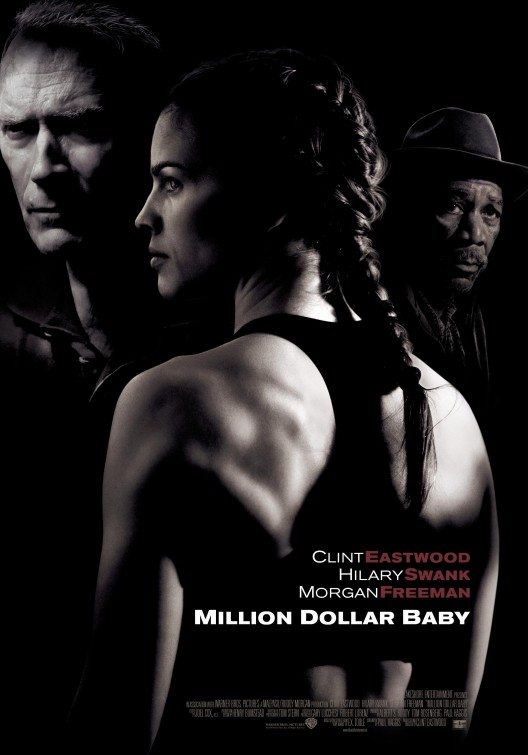
4. MILLION DOLLAR BABY
The poster eludes to a crime, action and thriller hybrid. The poser is nearly all black and so the use of this dark colours conote to mystery. The sans serif typeface at the bottom of the poster with the red colour to highlight the actors last names may indicate to danger/passion in the movie. The main character has her back facing away (adds to the tones of mystery of the poster) and face looking off to the side and is placed skillfully into the middle, her being placed there shows she is the protagonist and adds to the fact the target audience for the film will push towards females and also males too, as the female is quite muscular and so may not fit the gender norms placed on females.
No comments:
Post a Comment